

All are welcome!
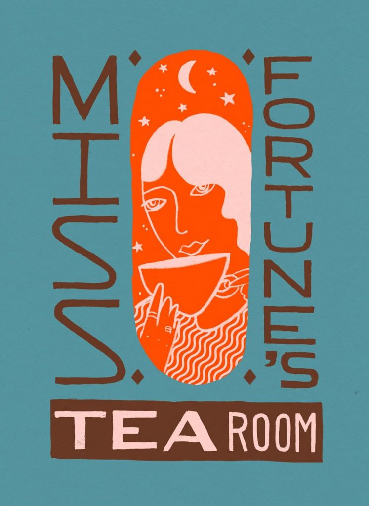
Matt, the Master of Fortune’s at Good Fortune Coffee Co., came up with the name and a general vibe for me to follow and I quickly set to work creating this full branding execution for Miss Fortune’s Coffee Shop & Tea Room. The latest in the Good Fortune family. Inspired by old time Fortune Tellers, jazz clubs, restaurants, and of course general whimsy.
We wanted to keep Miss Fortune’s in the Good Fortune family, vintage, hand made, nostalgia – but give her her own character to set her apart from The Seashore Cabaret and the Good Fortune Coffee Co. vibe.
I jumped straight into trawling the internet for inspiration from Japanese restaurants and clubs from the 30’s – 50’s eras and began to develop ideas from there.
Miss Fortune’s Pinterest Inspiration Gathering
Once Miss Fortune was found and the type style was established the final composition was formed! And then the fun of colour exploration got started.
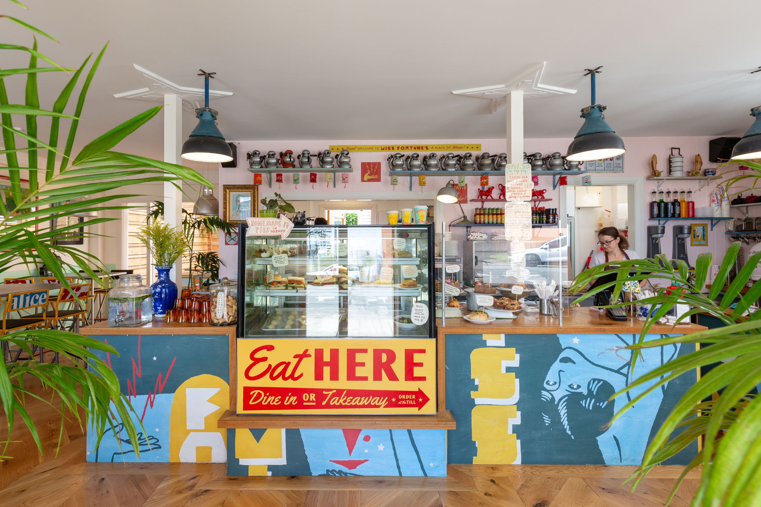
Next, was the challenge of seeing how the brand could translate across the facade of the building. I developed a typeface that I could play with for the signage.
Once the facade design was settled on it was hand painted by a local sign writer in Petone (wish I could have done it myself but they did a great job!).
Next up were the interior elements. The idea for the counter was that once this place existed in the nether regions of a non-time and aside the old brick building down lost alleyways was this 20 foot metal sign advertising Miss Fortune’s, we were able to salvage it when the building fell in the fire and cut it up to become the faces of our new counter.
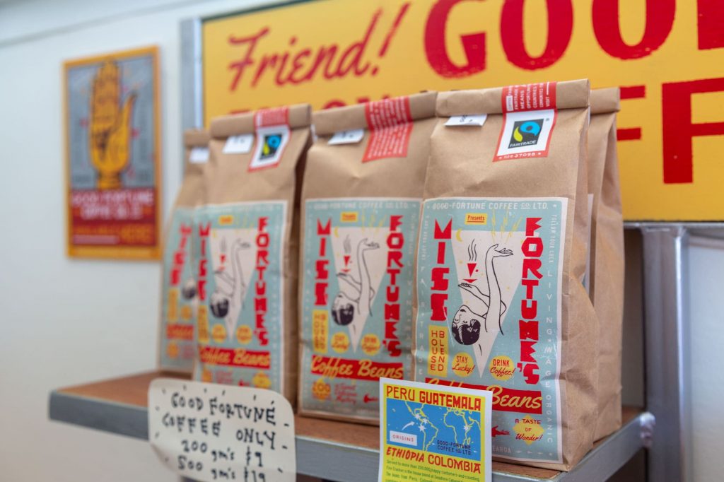
There was a whole lot of room left of the sheets of metal for the counter so I filled up every possible space with signs that could be sprinkled throughout the space.


All in all a wonderful success. Matt’s happy, I’m happy, and the world at large is enjoying the place. Couldn’t ask for more than that!